
CALQUENCE
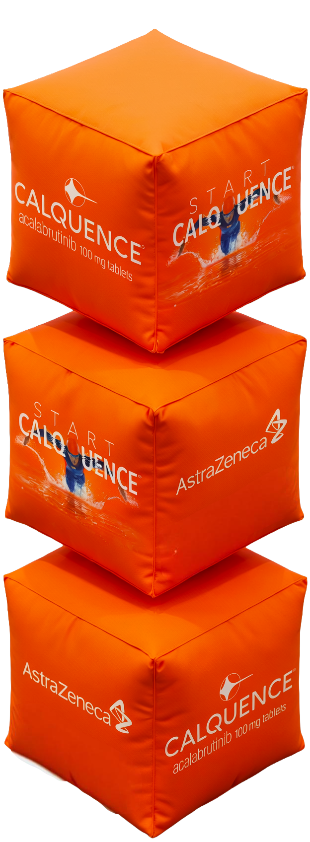
For the CALQUENCE® visual and spatial identity project, this product design concept explores modularity and patient care through custom stacked pillow-case cubes (36" x 36"). The design translates the pharmaceutical brand's structured reliability into a tactile, interactive-display format . By arranging soft, precision-sewn geometric cubes into a vertical stack, the piece balances clinical structure with comforting domestic materials. The layout emphasizes modular scalability, mirroring how individual treatment components fit into a cohesive, patient-centered journey.
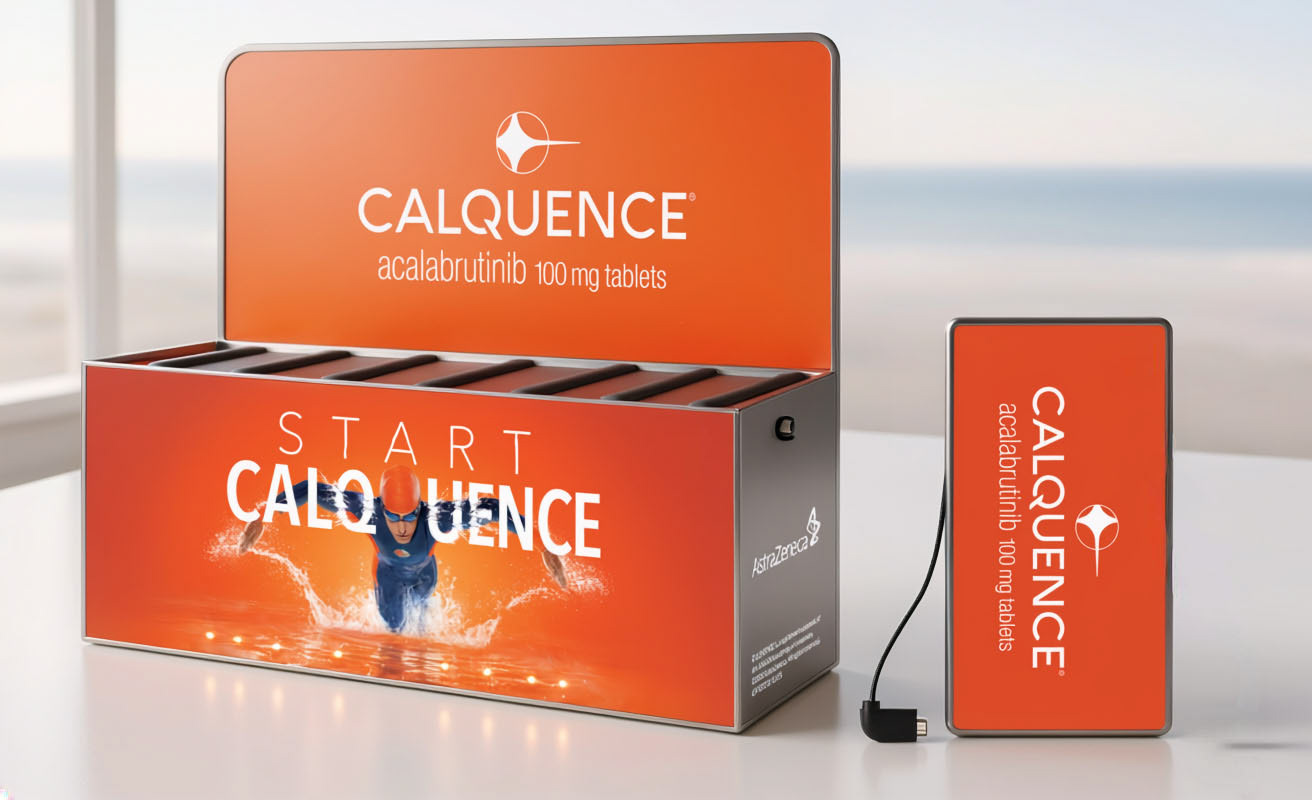
This experiential branding project features a custom visual wrap designed for a convention charging station as part of the Calquence "Start Strong" campaign. The charging hub symbolizes energy, momentum, and consistent support throughout their treatment journey. Bright, motivating color gradients and clear typography are strategically placed to engage individuals reinforcing a message of empowerment and resilience. By turning a high-traffic fixture into an uplifting touchpoint, the design creates an atmosphere of confidence for patients as they take their first steps toward managing their health.
IMFINZI + TAGRISSO
(AstraZeneca)
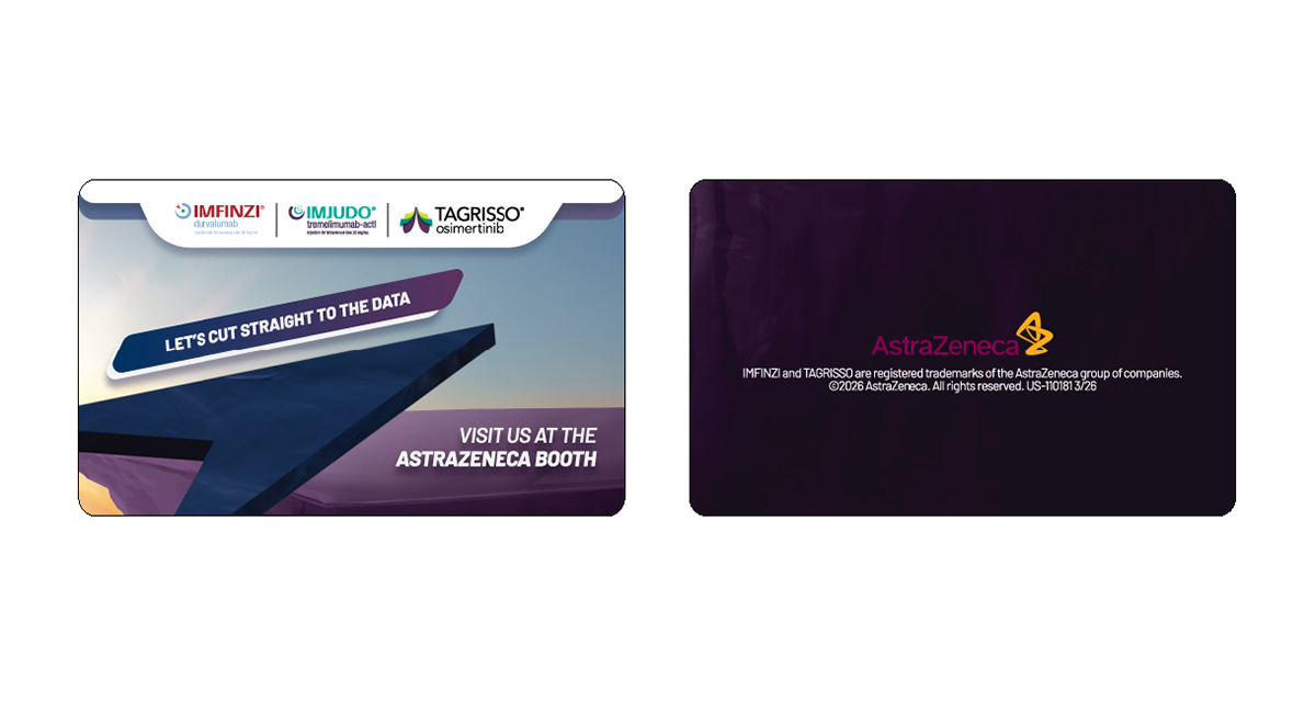
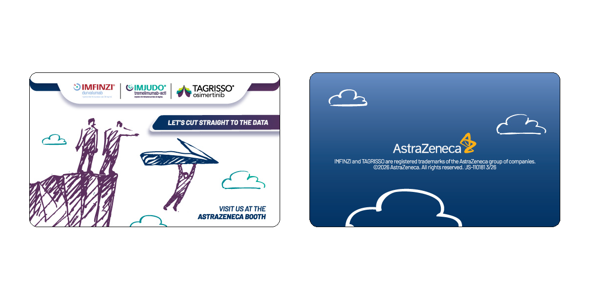
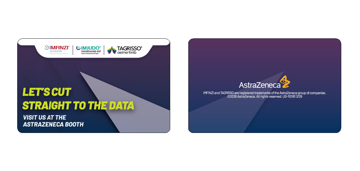
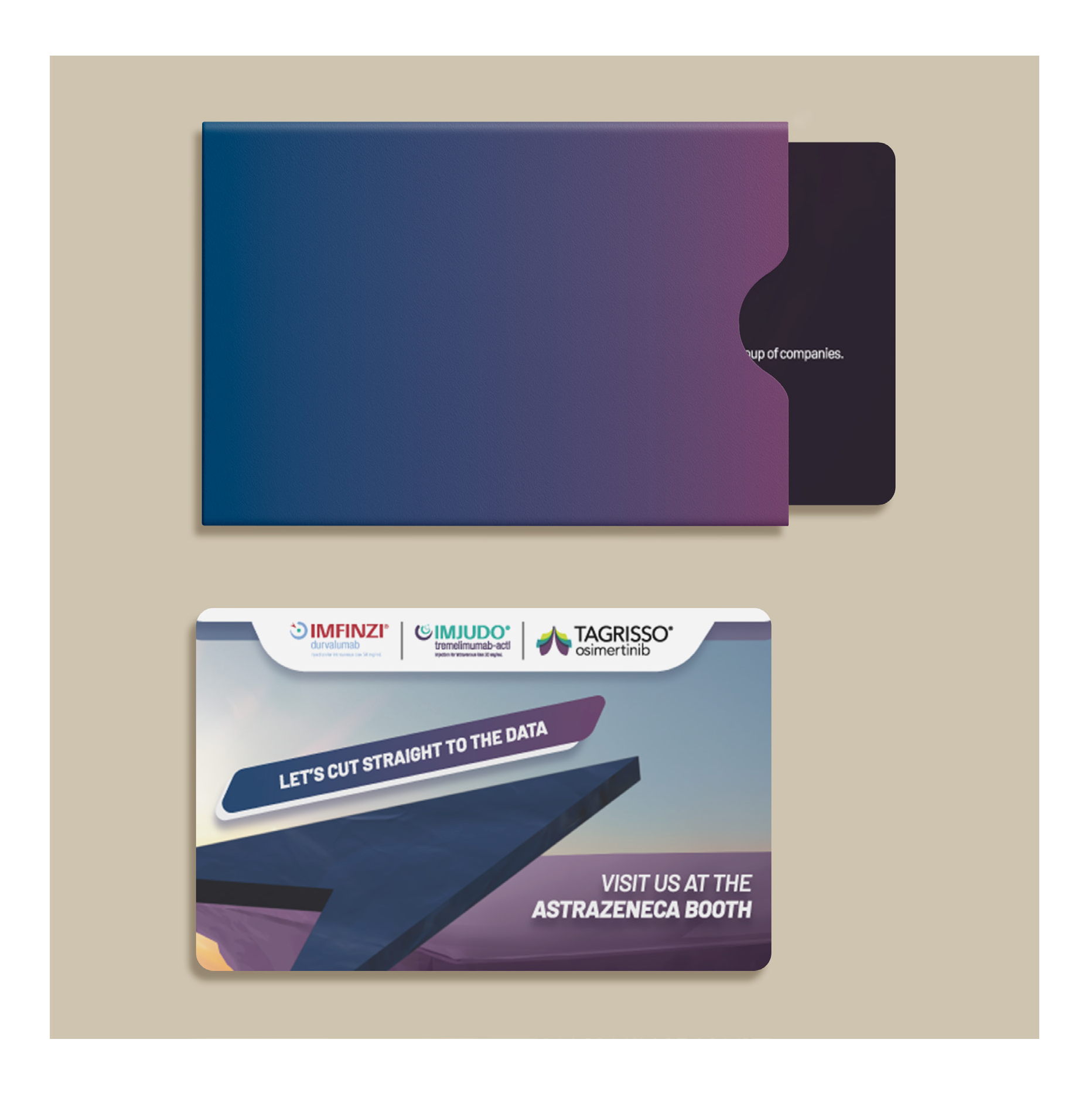
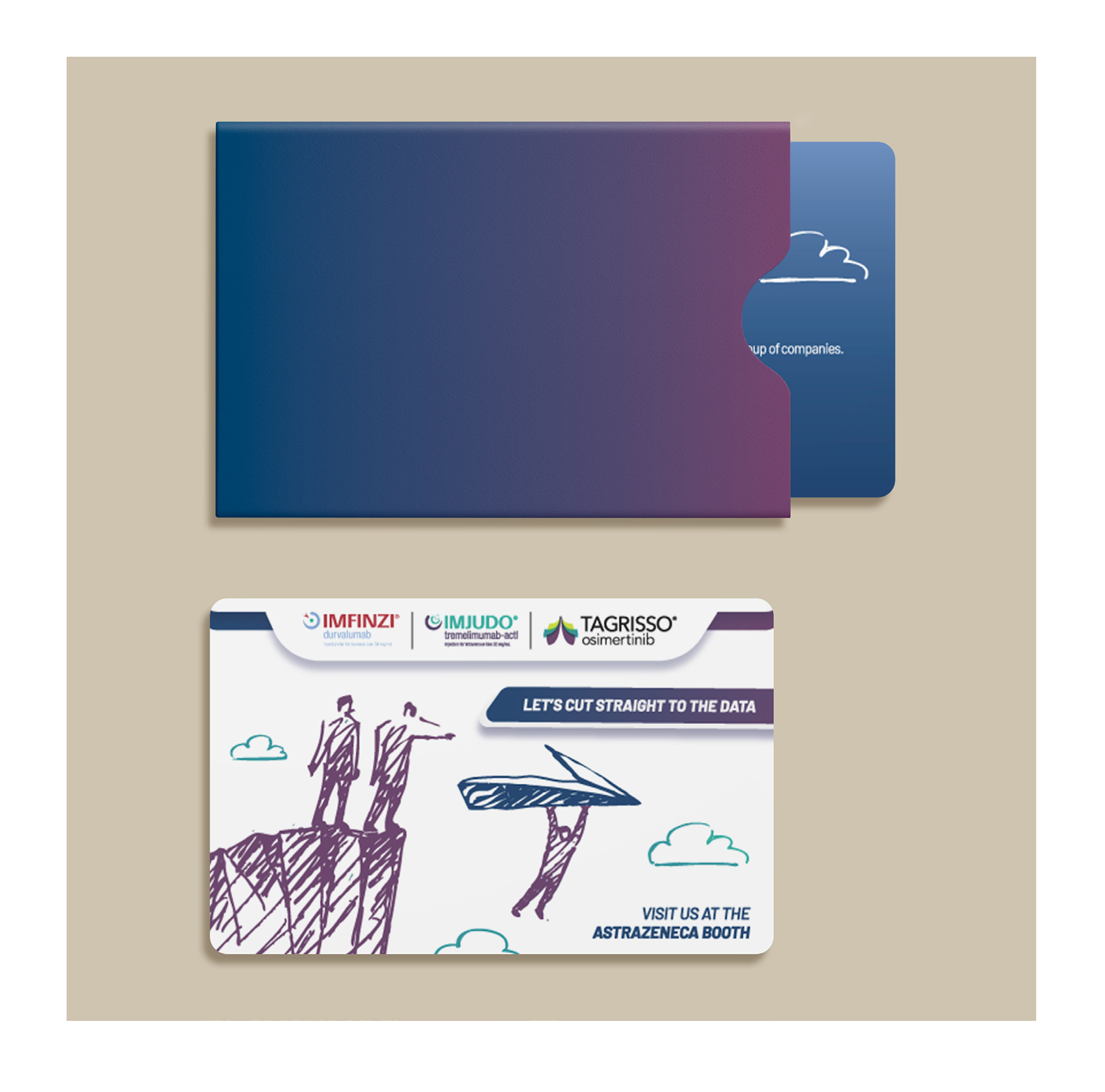
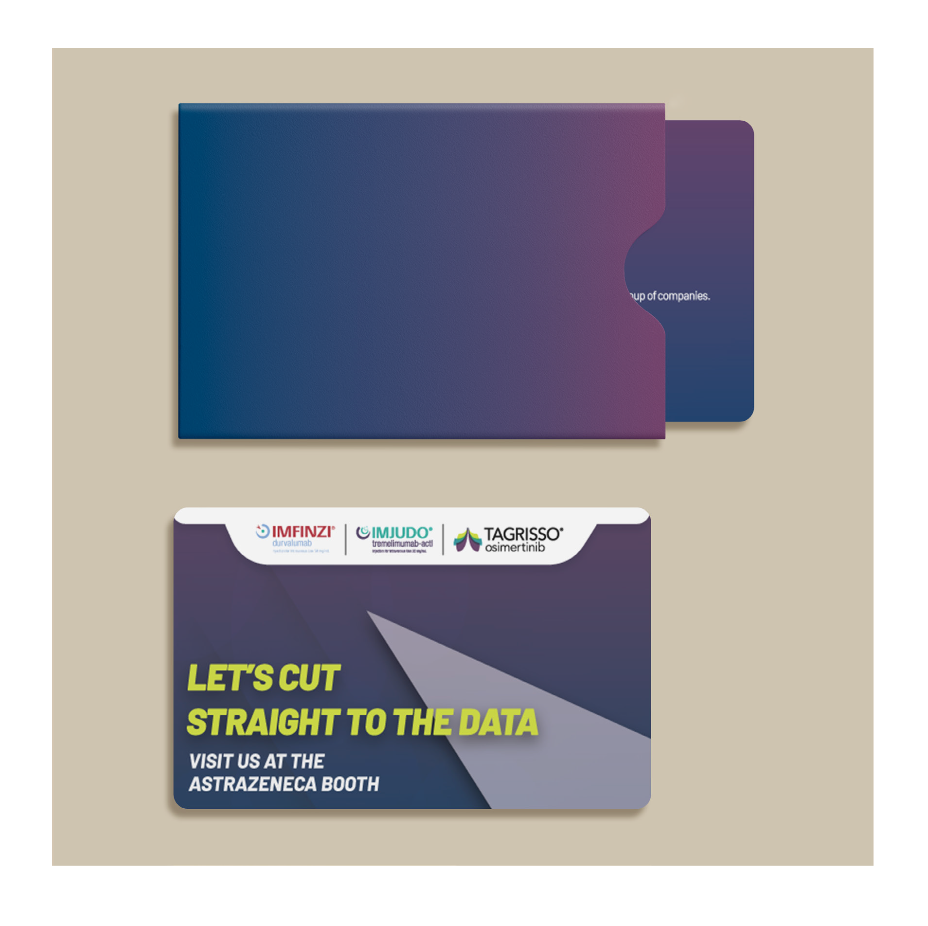
A collection of key cards for conference attendees. Featuring original artwork transforming the card into a miniature canvas. The surface design can be beautiful branding, or a more imaginative memento. Either way I wanted guests to feel like these could be keepsakes long after their stay.
LYNPARZA
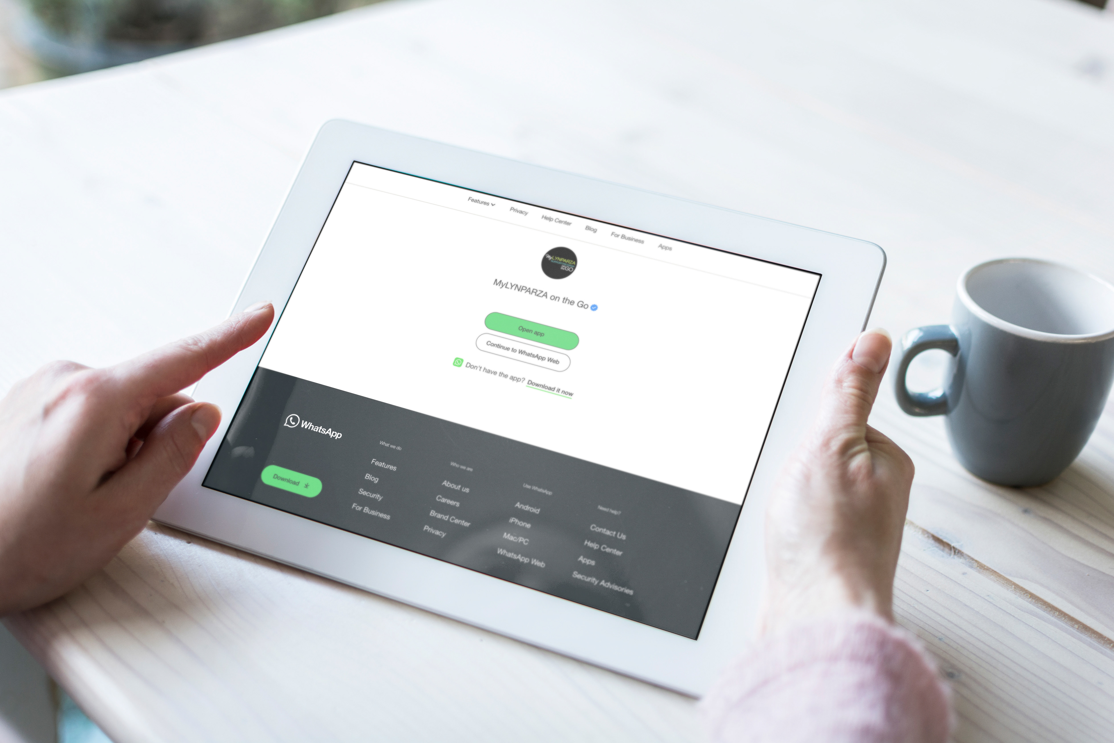
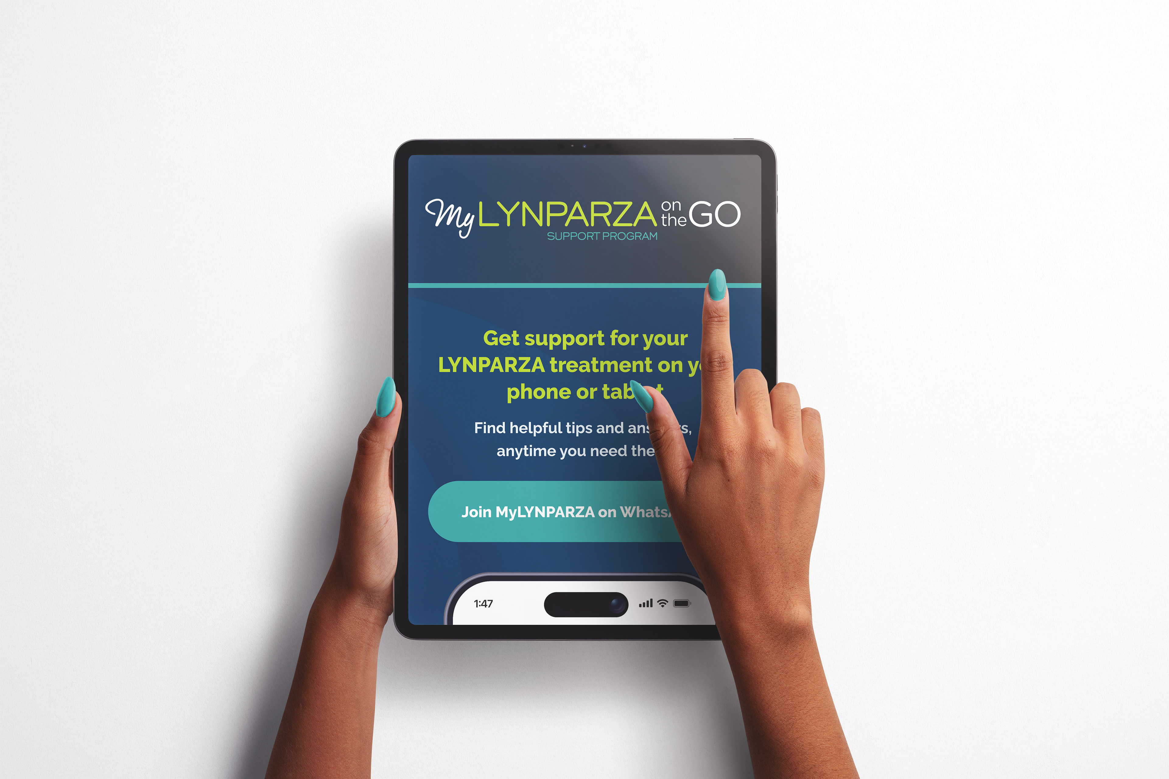
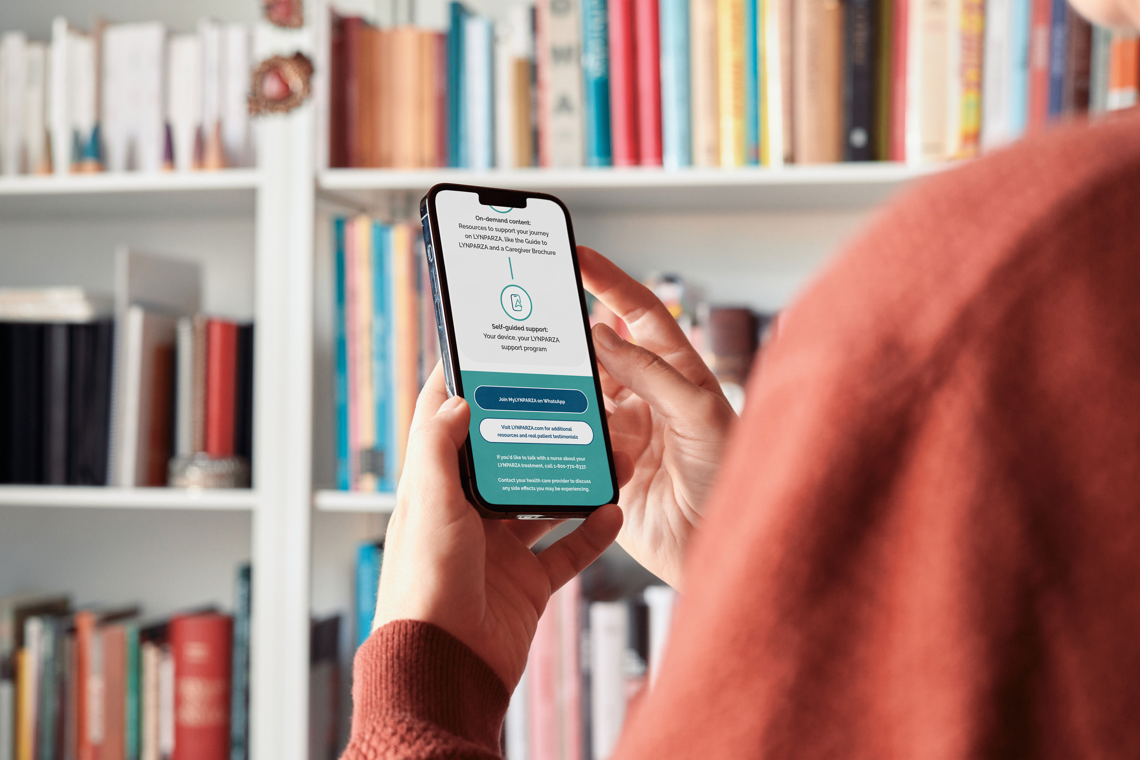
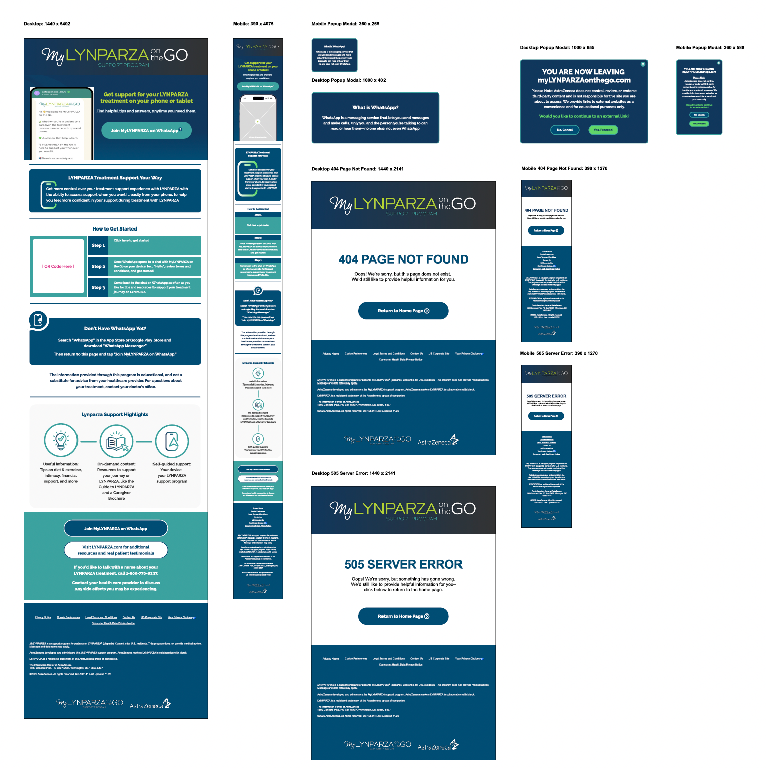
I served as the lead designer from concept through launch. Developing the "on the Go" logo to feel like a warmer, more personal extension of the parent brand, then designing and prototyping the full patient journey in Figma, from landing page to WhatsApp onboarding. The work meant balancing two often competing demands: the precision required in a regulated healthcare space, and the empathy needed to make someone mid-treatment feel supported rather than processed. Every interaction, from the QR code entry to the pacing of the three-step onboarding, was designed to get patients to real help as quickly and calmly as possible.
HEMATOLOGY AMBITION
(AstraZeneca)
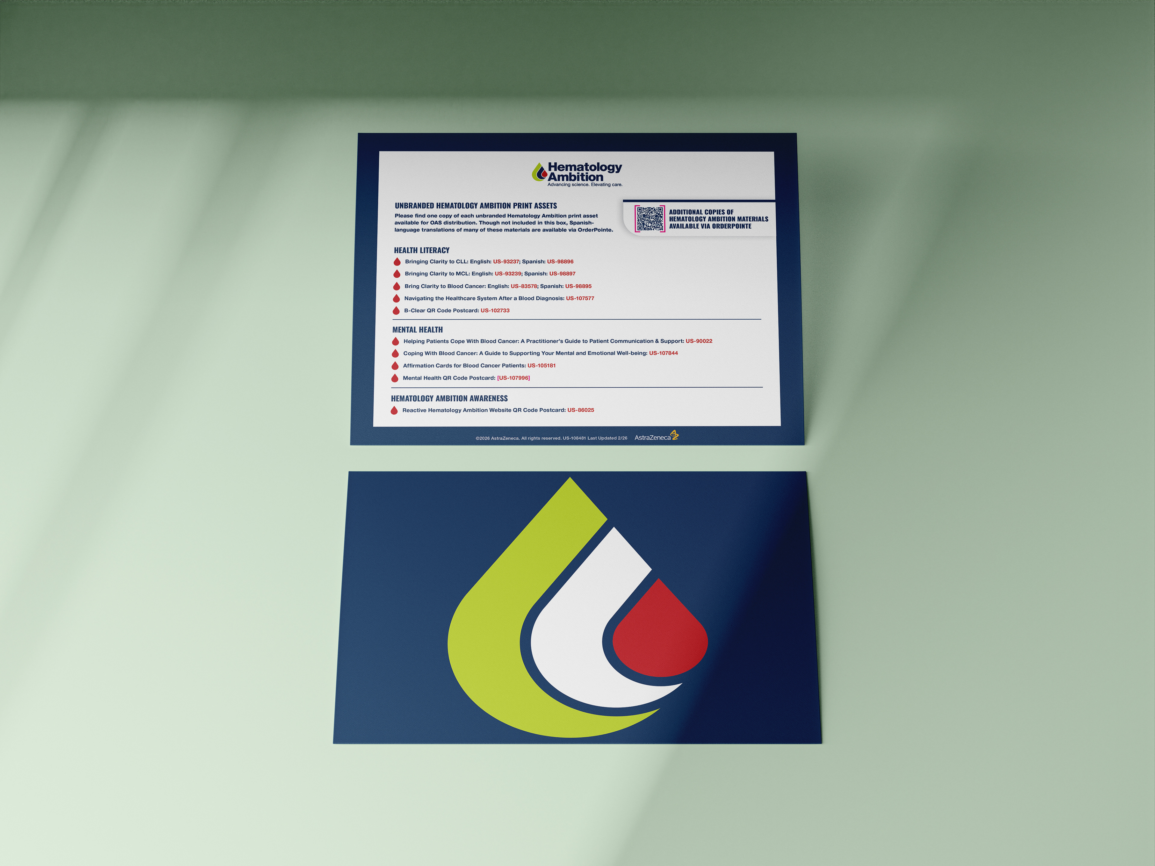
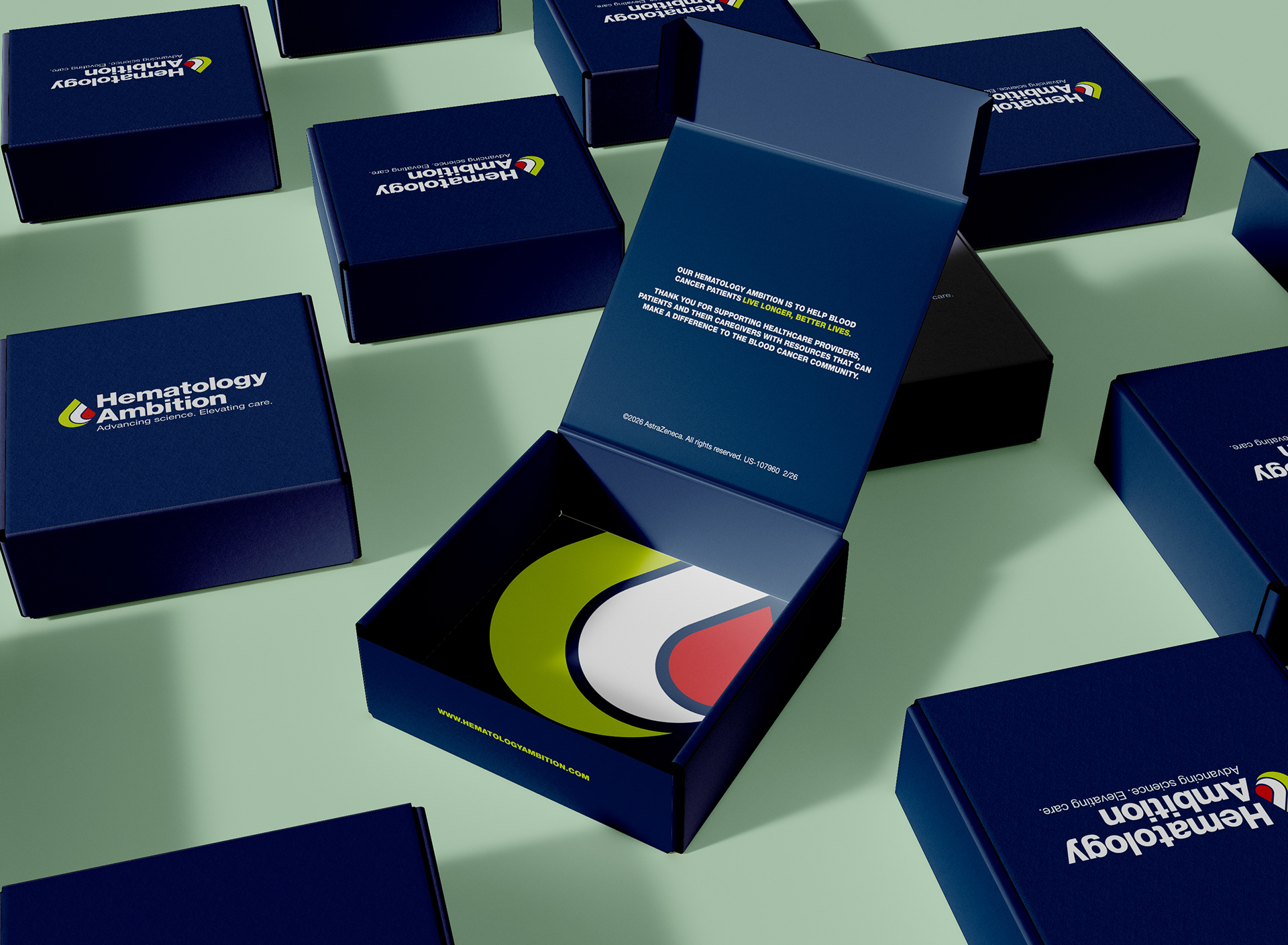
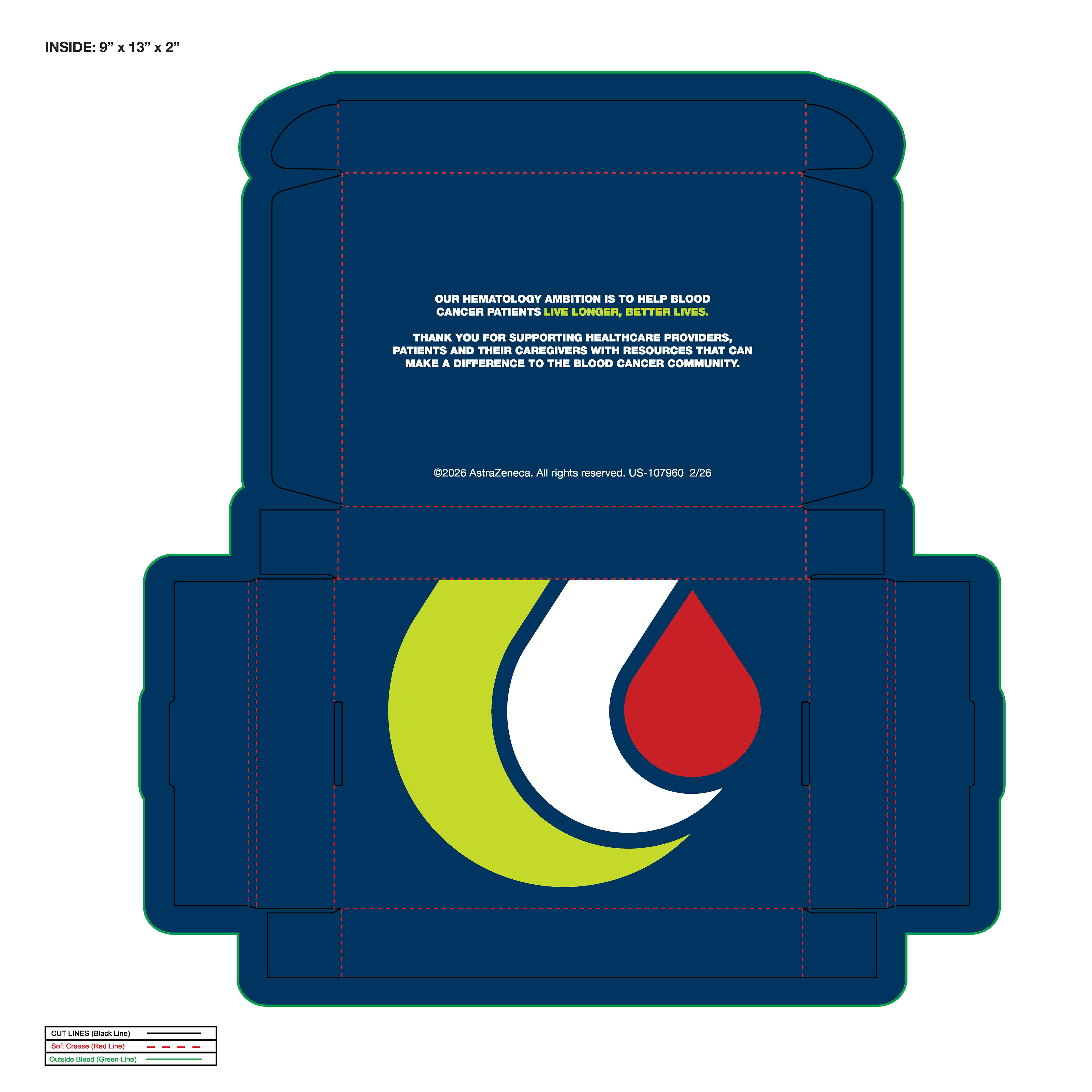
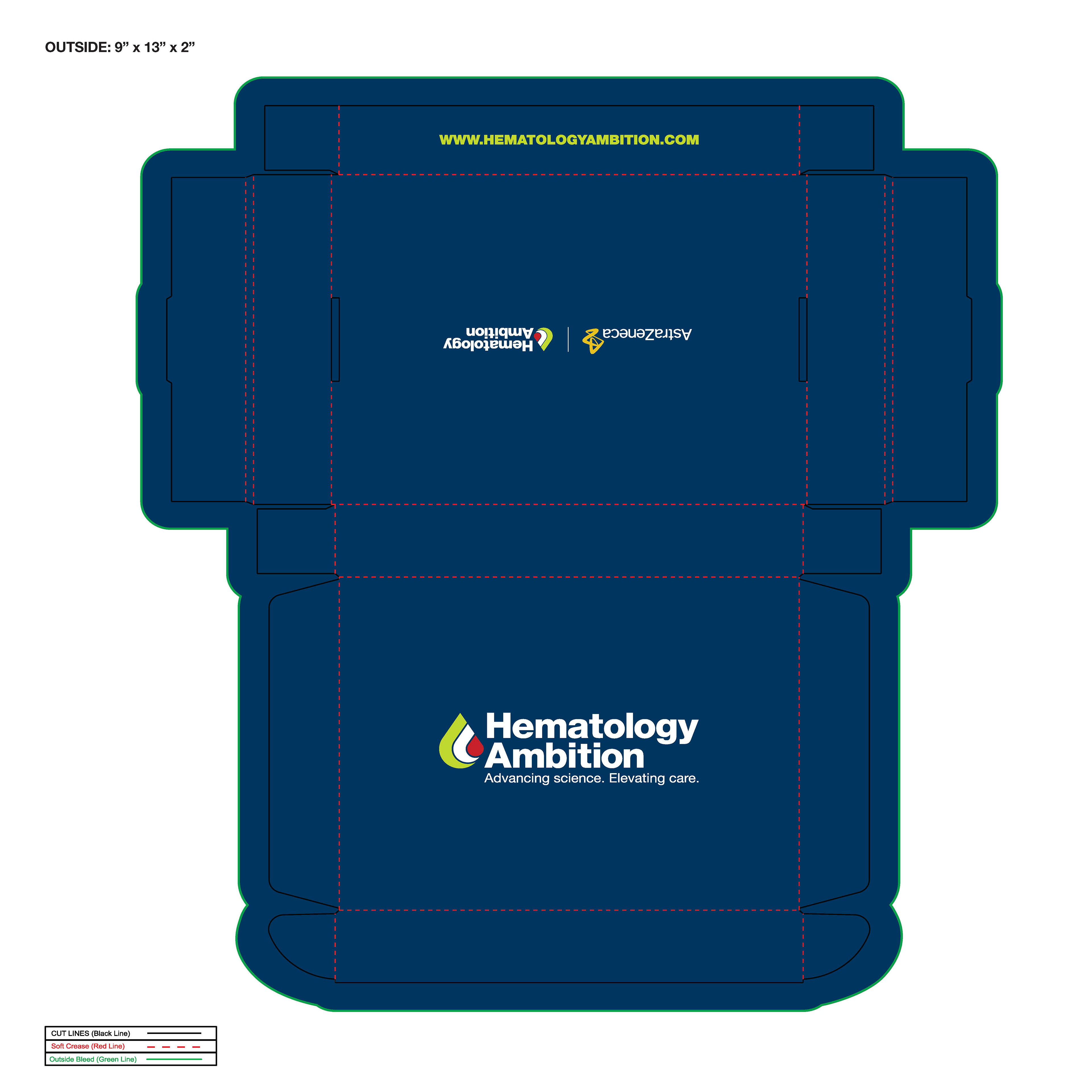
Packaging design for AstraZeneca's Hematology Ambition. Deployed these patient starter-kits to help newly diagnosed blood cancer patients and caregivers navigate care, understand specific conditions, and manage emotional well-being. Resources included daily affirmation cards, condition guides, educational materials covering Chronic Lymphocytic Leukemia (CLL) and Mantle Cell Lymphoma (MCL) to facilitate provider discussions.
IMFINZI
Animation/motion design for social media channels.
The IMFINZI® branding framework consists of visual elements mimicking water, fluid dynamics, and organic ripples that serve as a core thematic anchor across promotional and medical communication materials.
REIMAGINED PARKING
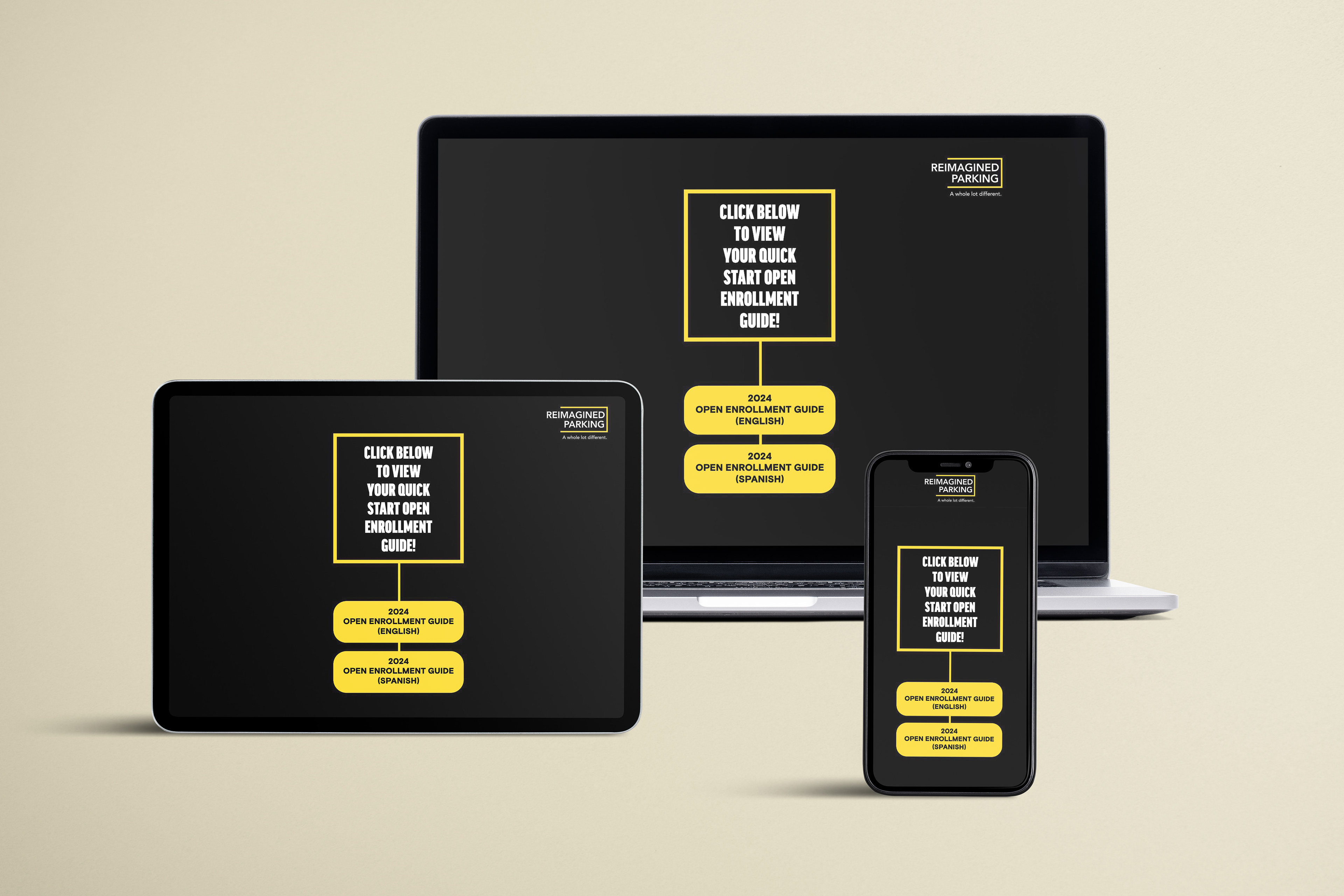
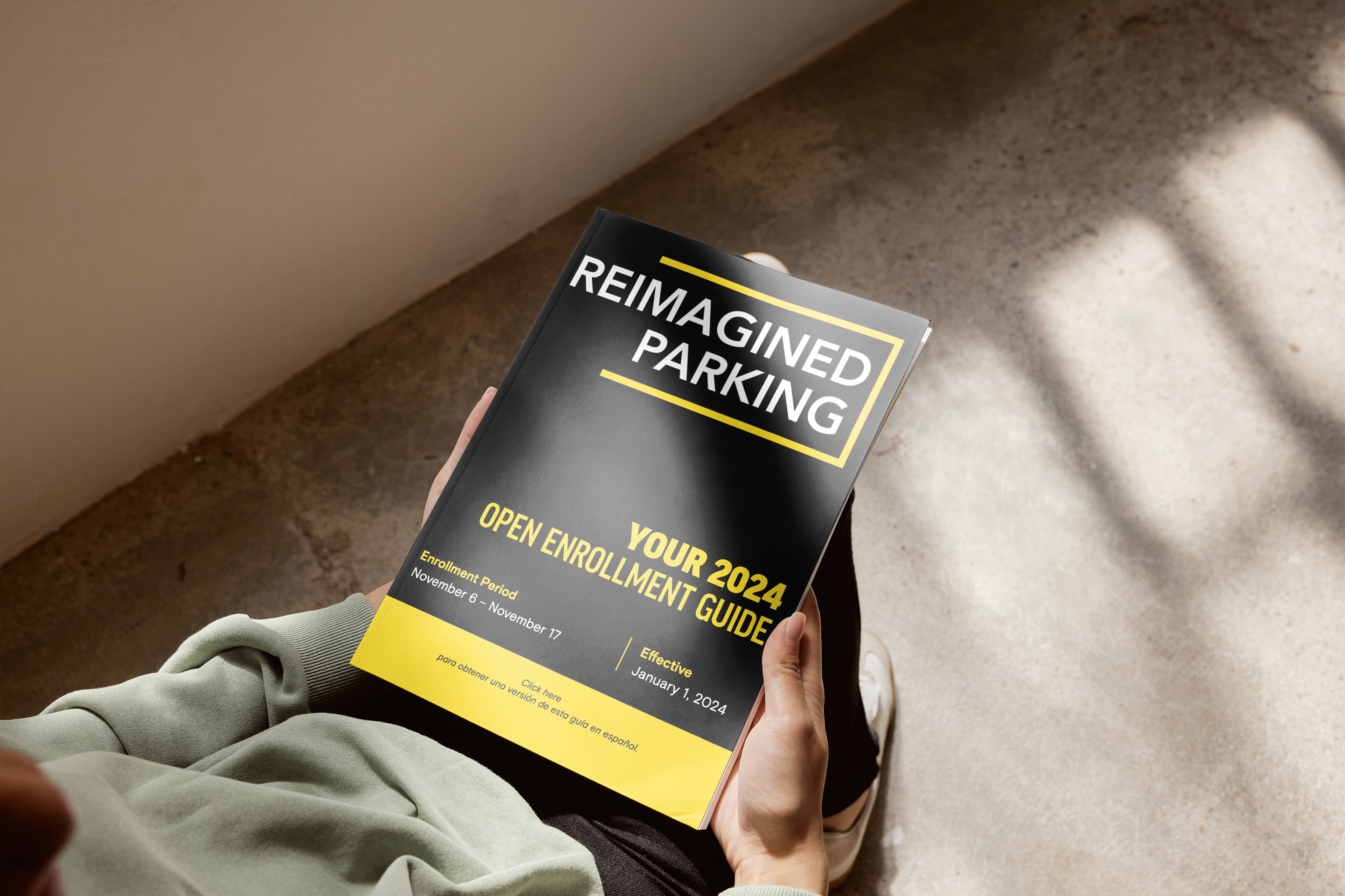
In 2024, I partnered with Reimagined Parking (formerly known as REEF Parking) to design a digital and physical enrollment experience for. Fresh off of a major corporate rebrand and organizational realignment, the challenge was creating a cohesive product and a visual
identity that didn't exist (yet).
identity that didn't exist (yet).
The vision was to create something as modern as Reimagined's new direction, that drives high engagement and informed decision-making by utilizing scannable layouts, visual storytelling, and multi-format delivery to meet employees where they are.
We decided that we didn't want to replace static PDFs but build on that touchpoint by incorporating an interactive microsite, a web-based flip book, and a mobile-friendly
benefits app.
benefits app.
The microsite featured a robust table of contents and a "Quick Navigation" structure so
staff can easily find the exact information they need. By introducing an interactive format to the fold it empowered employees to make informed decisions, easily navigate, and find exactly what they need.
staff can easily find the exact information they need. By introducing an interactive format to the fold it empowered employees to make informed decisions, easily navigate, and find exactly what they need.
The Northeast Government Executives Council (NEGEC)
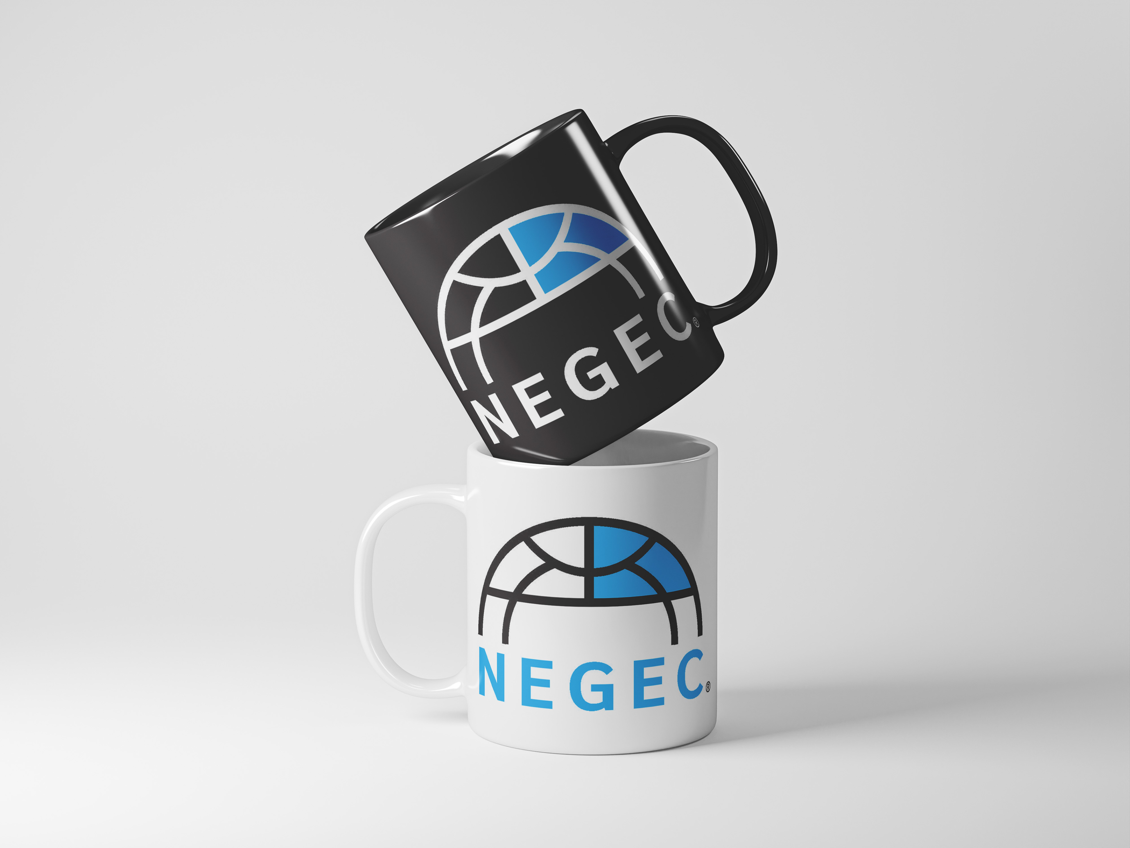
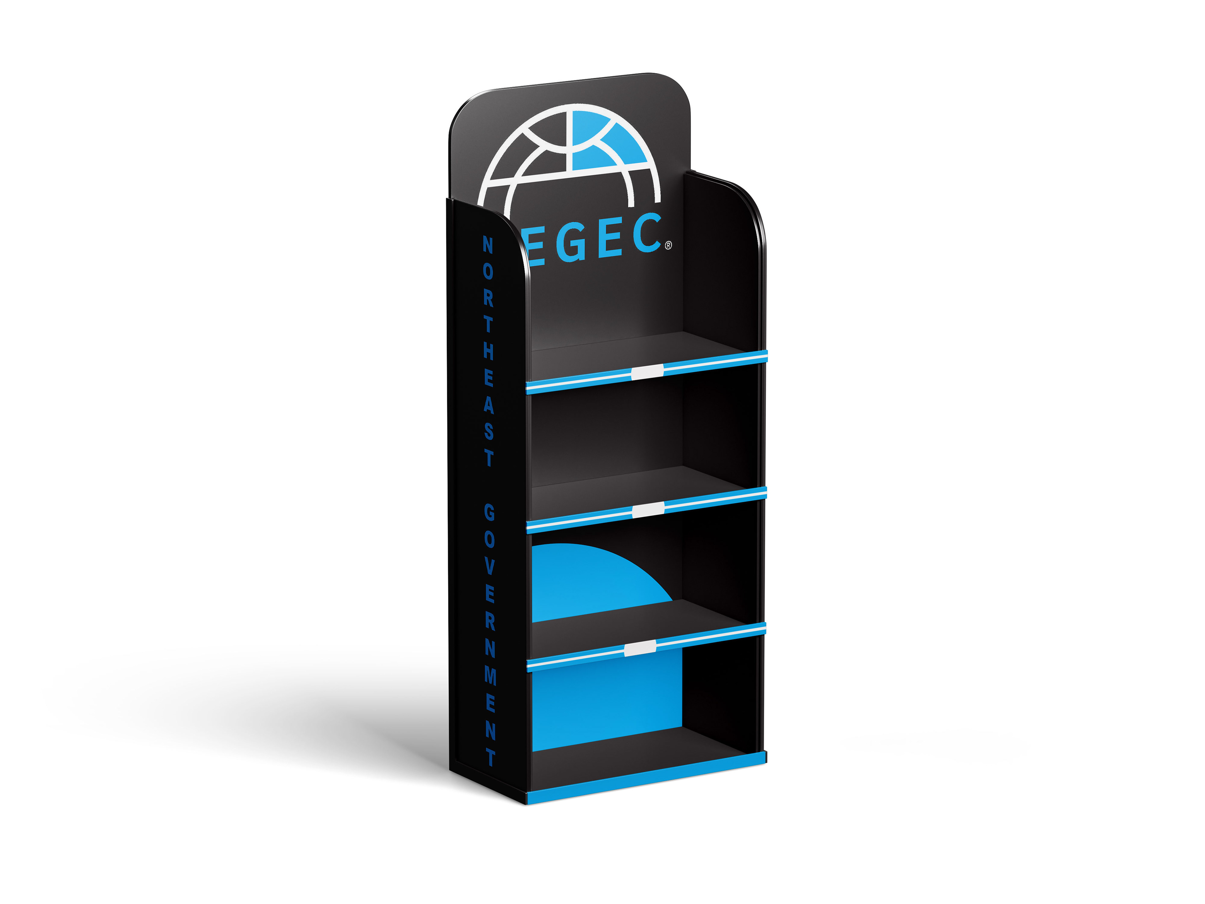
Logo design for the Northeast Government Executives Council (NEGEC). A Boston-based professional organization established for senior-level executives working across schools, municipalities, and counties. It provides a forum for municipal leaders to network, participate in professional development, and discuss regional government management.
Lockton Companies
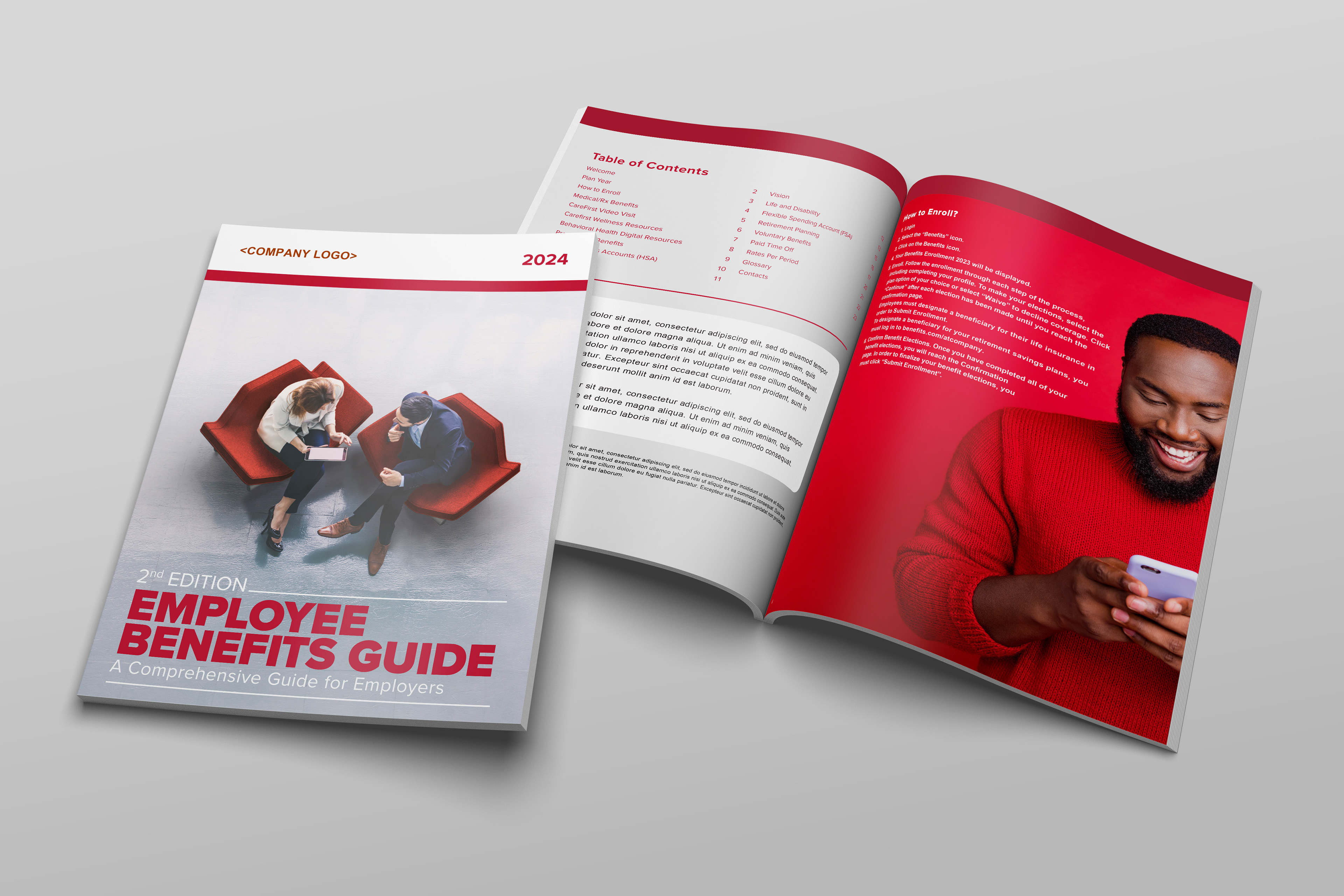
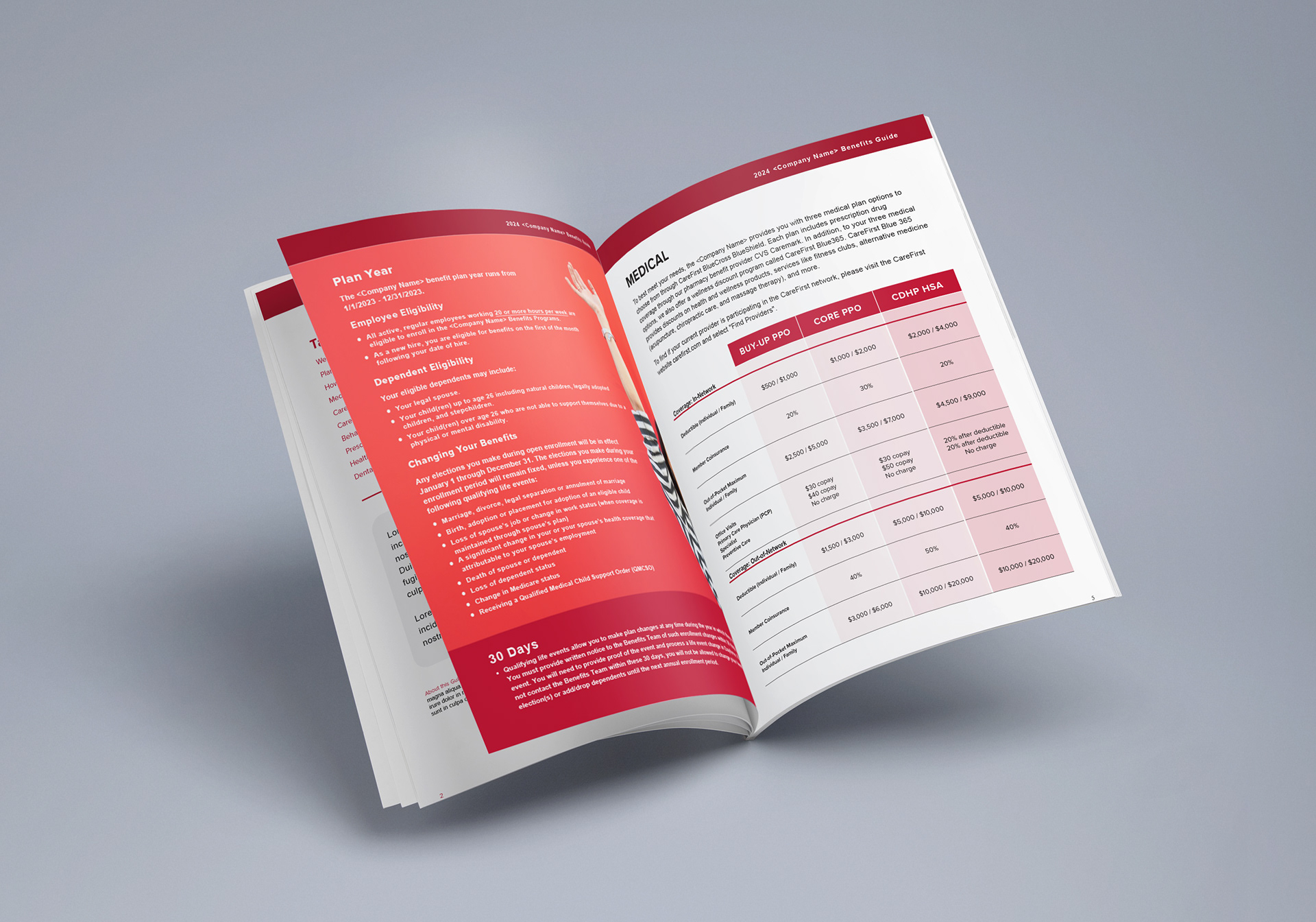
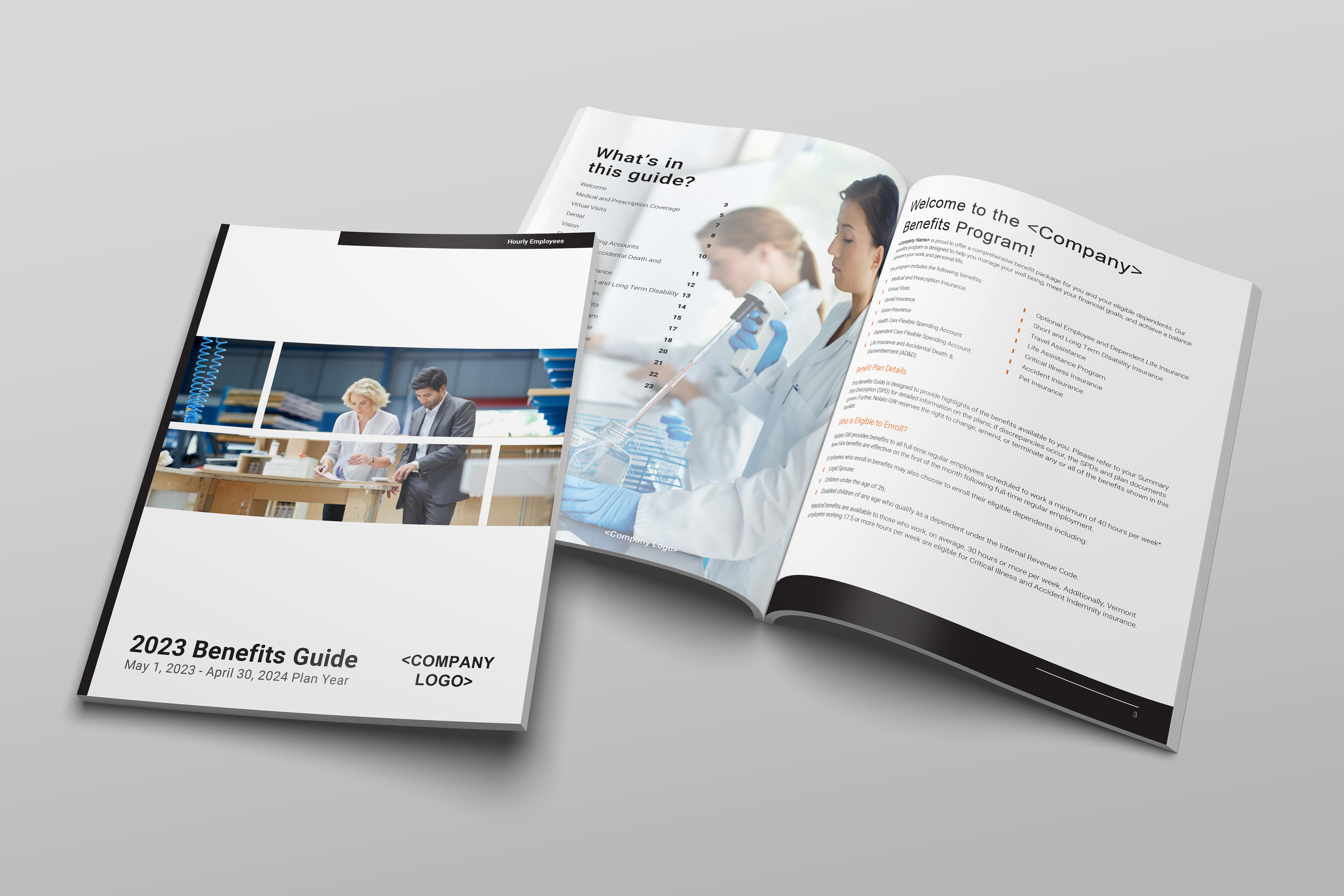
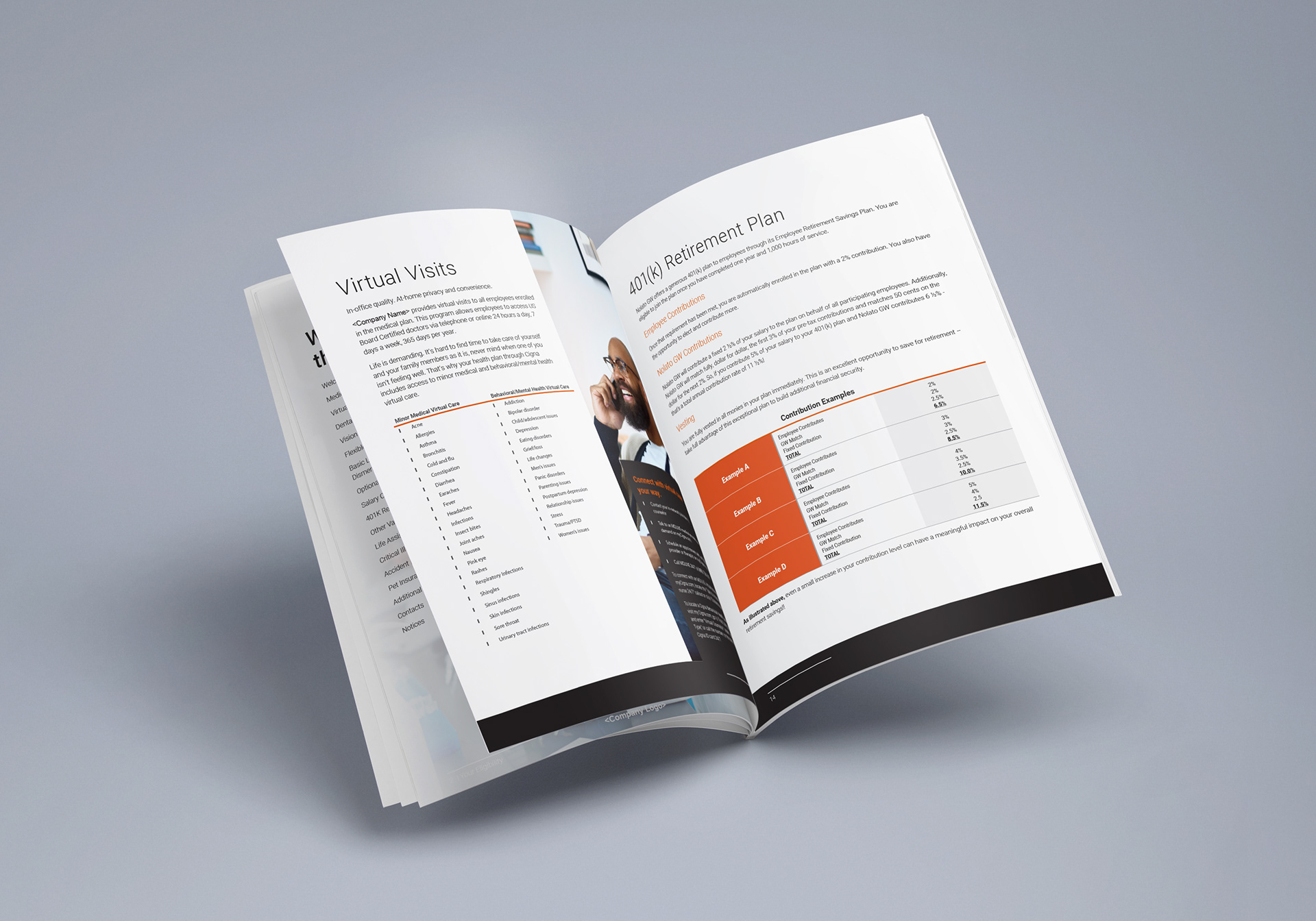
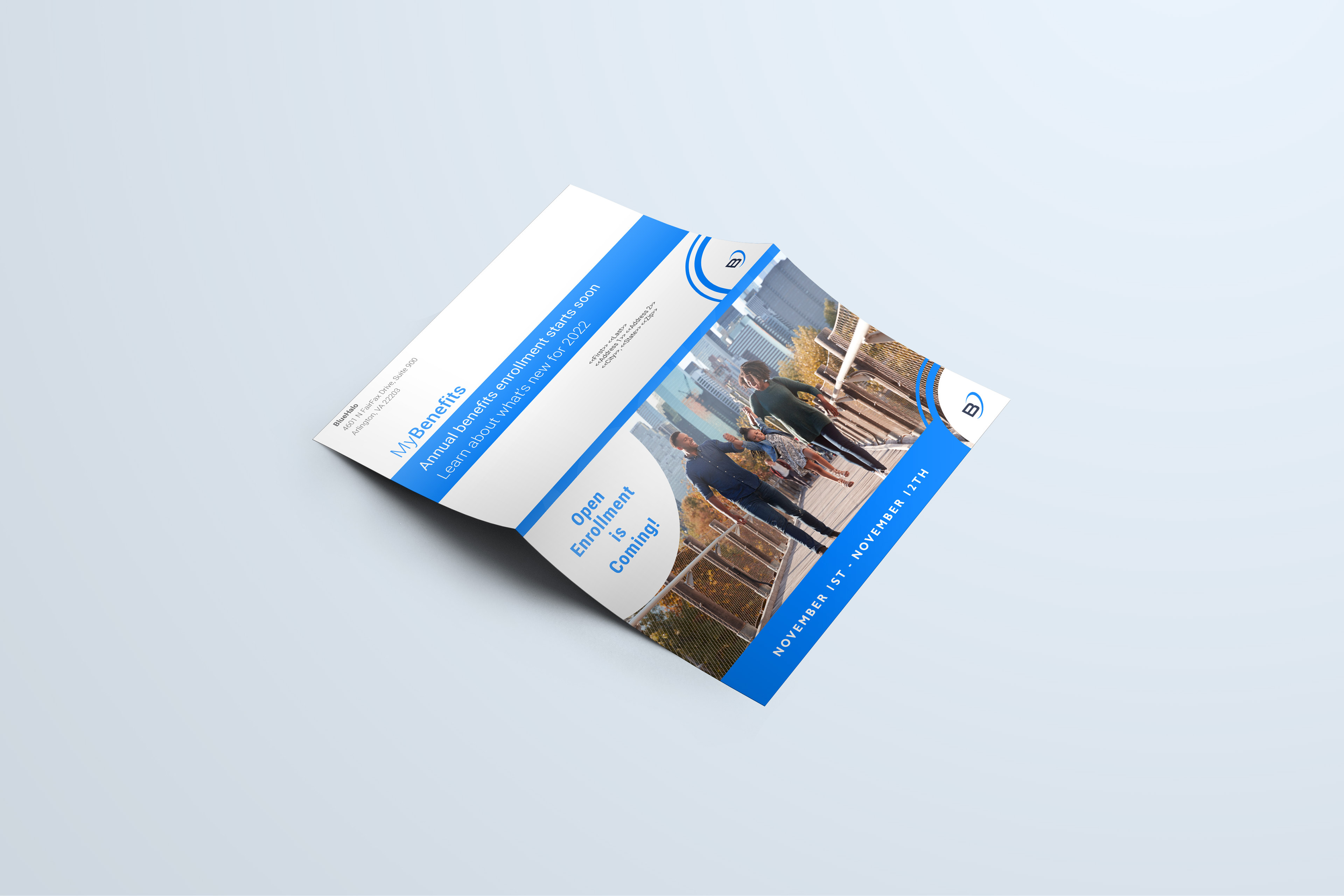
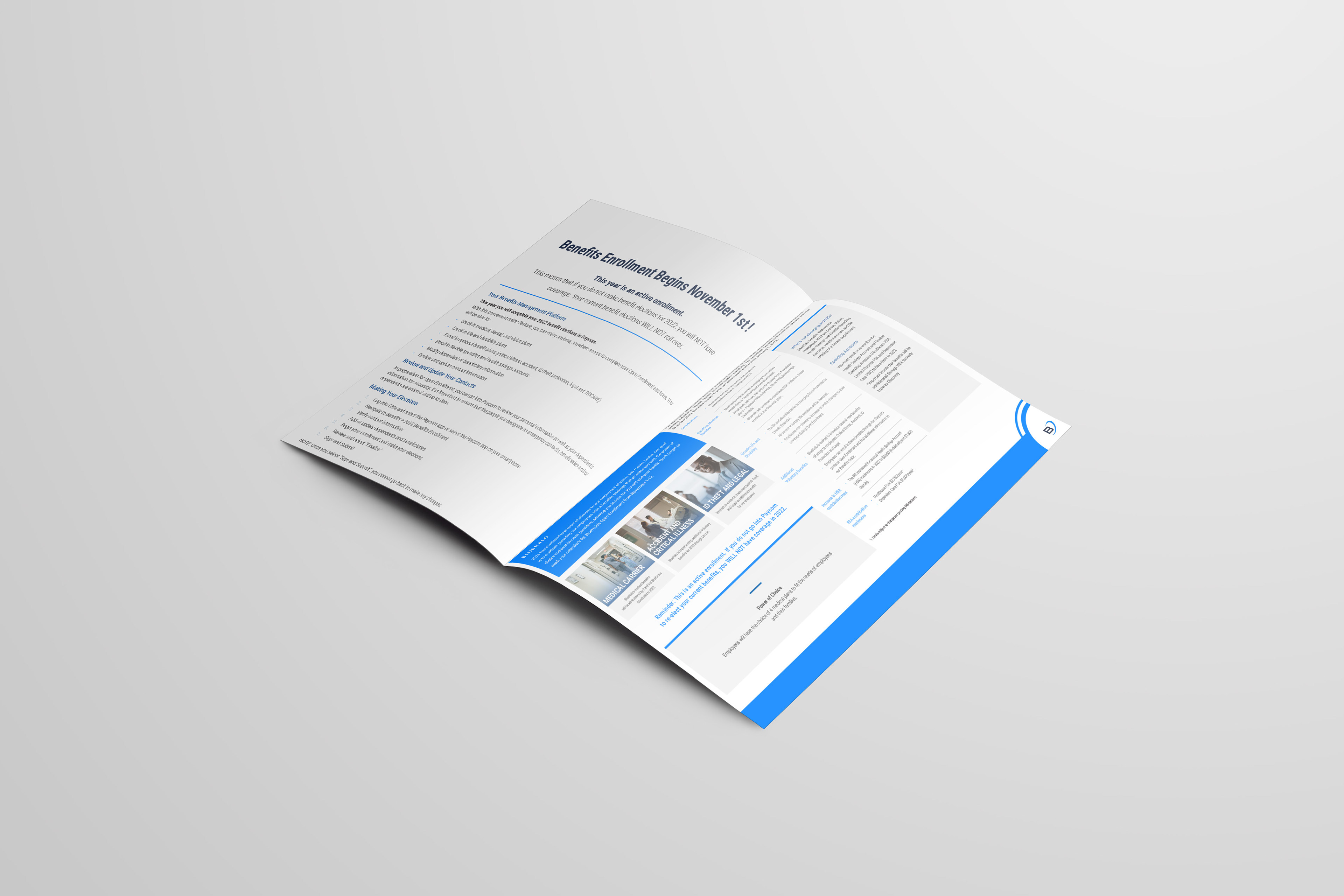
A well-designed guide should be beautiful, visually very clear at first glance, but can also lead readers in depth in finding pertinent information. The very challenge is to think about the data as journalists rather than analysts. These guides can be curated for different employee groups within each client's workforce. The visual design choices were made to help find potential correlations.